
Introduction
First, I would like to thank Carol Boss from Hahnemuhle, for generously sending me a few sheets of this soon-to-be-released new paper to test.
For the last ten years or so, Arches Platine has been my standard paper for platinum/palladium prints. I also use Bergger COT320 as a slightly warmer (paper base color) alternative. Prior to that, I also used used Crane’s Cover Natural White Wove (aka Platinotype) and Van Gelder Simili Japon, along with Platine, on a regular basis. For special projects, I have used other papers such as Swiss Opaline Parchment, Fabriano Perugia, and Gampi Torinoko. I have tested dozens of papers over 25 or so years that I have been practicing platinum/palladium printing. The one overriding lesson that I have learned is that paper is a moving target. Inconsistencies from batch to batch can be subtle or dramatic, especially with those papers not specifically made for this process, but also with those that supposedly are. The ill-fated Magnani Revere Platinum is a perfect case study of how good and bad a paper can be. The initial samples I received were wonderful, but the stuff I bought was unusable. This was well documented elsewhere so I won’t go in to further detail here.
This is all to preface that I look at any new paper for platinum/palladium printing with a critical eye and a cautious optimism. A couple weeks ago, 2/8/16, the silence was broken when Christina Anderson announced that she had been beta testing a new paper from Hahnemuhle to be called Platinum Rag, and Kerik Kouklis followed up a couple days later with a blog post. Not long after, I was contacted by Carol Boss from Hahnemuhle asking if I would like a few sheets to test. Last week I received a package containing 4 11×15 sheets of Hahnemuhle Platinum Rag which I have spent the last few evenings testing. What follows are my first impressions based on my testing procedure with the limited amount of paper I had to work with.
Methodology
I primarily print from original large-format negatives, so even with my best efforts to produce negatives optimized for Pt/Pd I don’t always hit my mark and therefore need to use some form of contrast control at the printing stage, unlike those who print from digital negatives which can easily be tailored to any process. My preferred method of contrast control is to add sodium hexachloroplatinate (usually abbreviated Na2 in the Pt/Pd world) to my coating solution using a set of serial dilutions made from the 20% stock solution available from Bostick & Sullivan. My full set includes the following dilutions: 0.3125%, 0.625%, 1.25%, 2.5%, 5%, 10%,and 20%. This gives me 7 “grades” of contrast. This range of dilutions is useful for 4×5 prints. For 8×10 prints, the minimum useful dilution is 1.25%, and higher contrast levels are achieved with multiple drops of 20% though this is rarely needed.
Also, long ago when I started making prints larger than 8×10, I found that the traditional drop counting way of measuring out the coating solution was not very accurate or precise (or maybe I just couldn’t count that high!) so I switched to using pipettes and measuring in milliliters. A typical 8×10 print on most papers requires 2ml of solution — 1ml ferric oxalate + 1ml palladium — to which I add 1 drop of the appropriate dilution of Na2 and 2 drops of the surfactant Tween 20 (1 drop per ml). It is my experience that Tween 20 is beneficial for most papers, but not all printers agree.
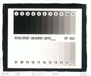
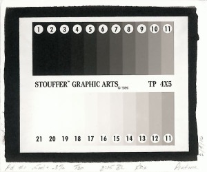
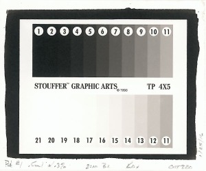
I use a 4×5 Stoufer 21 step wedge as my test negative for the first round of evaluation. I print the 21 step at each of the 7 grades which I then measure and graph using Phil Davis’s ancient BTZS Plotter software. This gives me a graph of the response of the paper to each contrast level at 1/2 stop increments, revealing the shadow compression typical of the Pt/Pd process, the long toe of the highlights that is characteristic especially of palladium, the shortening of the exposure scale as contrast increases, and the relative speed for each grade. It also provides a chart that can be used to match negative density range (DR) to the exposure scale (ES) of each grade.
The particulars of my printing procedure are as follows:
- Cut paper to 5×6 or 5.5×6.5
- Measure out sufficient solution to coat 8 sheets – in this case 0.5ml per sheet or 4ml total — 2ml ferric oxalate + 2 ml palladium + 4 drops Tween 20. Swirl to mix.
- Draw 0.5ml of solution with pipette or syringe and place in separate container. (I use little 1 oz medicine cups.)
- Add 1 drop of Na2 and swirl to mix.
- Coat paper using glass rod or brush.
- Let coated paper rest long enough to be dry to the touch – about 5 minutes in my darkroom at 60-65% RH. *
- Place paper and negative in printing frame and expose to UV light. With my Hitachi BL bulbs the standard exposure time is 2:15. (Yes, 2 minutes and 15 seconds – wicked fast!)
- Develop in Potassium Oxalate (KOx) at room temperature for 5 minutes.
- Clear in 3 consecutive clearing baths (1 liter water + 1 tbsp each EDTA, citric acid, and sodium sulfite) for 5 min in each bath.
- Wash in gently running water for 20-30 minutes.
- Let water drip off for a few seconds then place on screen to dry.
* I long ago stopped using warm air to speed up the drying step. Unless you are working in a very humid environment it is just not necessary. An exception to this would be with very absorbent papers that take a very long time to dry.
The evaluation procedure, which I learned from Dick Arentz 25 years ago, is like this:
- Wait until paper is completely dry.
- Read and record each step of the 21 step from darkest to lightest.
- Enter the readings into BTSZ Plotter.
- Print out results.
- Compare to similar tests of other papers.
Note: I am currently using a Spyder 3 Print SR spectrophotometer to make the readings. It works but has a down side in that it won’t allow me to zero on paper white. For comparing papers this is fine, but it skews the analysis a small amount toward higher contrast than what I find in practice. My X-rite 400 black and white reflection densitometer which I have used for this purpose since the ’90s malfunctioned a couple years ago (just before a workshop of course!), but I finally sent it in to be repaired and look forward to using it again, and seeing just how accurate or not the Spyder is. A benefit of the Spyder is that in addition to measuring density it also provides LAB readings which can be used to compare relative warmth or coolness of paper base and image tone, though I’m new to LAB readings and am unsure how to interpret them.
Results
For comparison, I am also providing data for Arches Platine and Bergger COT320, both of which I have retested recently.
Hahnemuhle Platinum Rag
- DMax: 1.42
- Dmin: 0.03
- Paper Base: L=97.42; a=1.56; b=1.83
- Maximum ES: 1.87
- Minimum ES: 1.05
Arches Platine
- DMax: 1.40
- Dmin: 0.03
- Paper Base: L=97.10; a=1.64; b=02.47
- Maximum ES: 2.00
- Minimum ES: 1.20
Bergger COT320
- DMax: 1.36
- Dmin: 0.04
- Paper Base: L=97.04; a=0.88; b=2.77
- Maximum ES: 1.84
- Minimum ES: 1.08
An analysis of this sort is useful to a degree, especially if you do as lot of printing with original film negatives like I do (as opposed to digital negatives), but the real question is how does it print? Here are a few observations:
- As others have pointed out, HPR has a very hard surface that is slow to absorb the coating solution. As a result, it can be coated using about 20-25% less solution than the other papers in this comparison.
- I found it absolutely necessary to use Tween 20 in the coating. Leaving it out resulted in poor absorption and a very speckled print from paper fibers that did not absorb any solution.
- The tonal scale is very smooth. There is no mottling and no abrupt transitions. This is true of the current Platine and COT batches that I have tested, and is something I look for in any paper I consider using.
- All things the same, it prints a bit more contrasty than most papers. Some may like this, others may not.
- Dmax is measurably higher than Platine and COT. I can’t see the difference between HPR and Platine, but I do see it with COT.
- Palladium on HPR has a very nice warm image tone developed at room temperature in KOx. Maybe a bit warmer than the others. Heat the developer up to 120°F and it gets really lovely. I think this is my favorite thing about this paper.
- The paper base tone of the 3 papers are quite similar. There are differences that are more or less noticeable if you look closely in just the right light, but they are slight. Some have said that HPR is a brighter white than the others but I can’t really see it. If anything, COT may be very slightly creamy compared to the others.
- Others have reported that exposure times may be slightly faster than Platine and COT, but I did not find that to be the case. If anything it might need a bit more exposure with my setup.
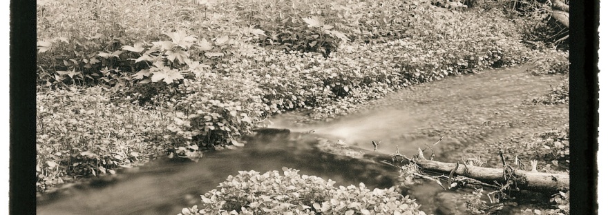
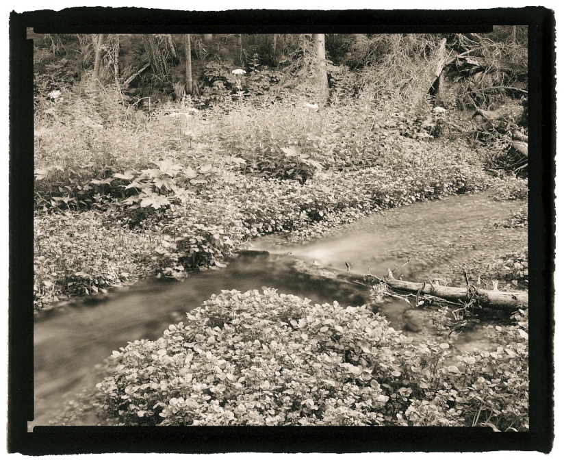
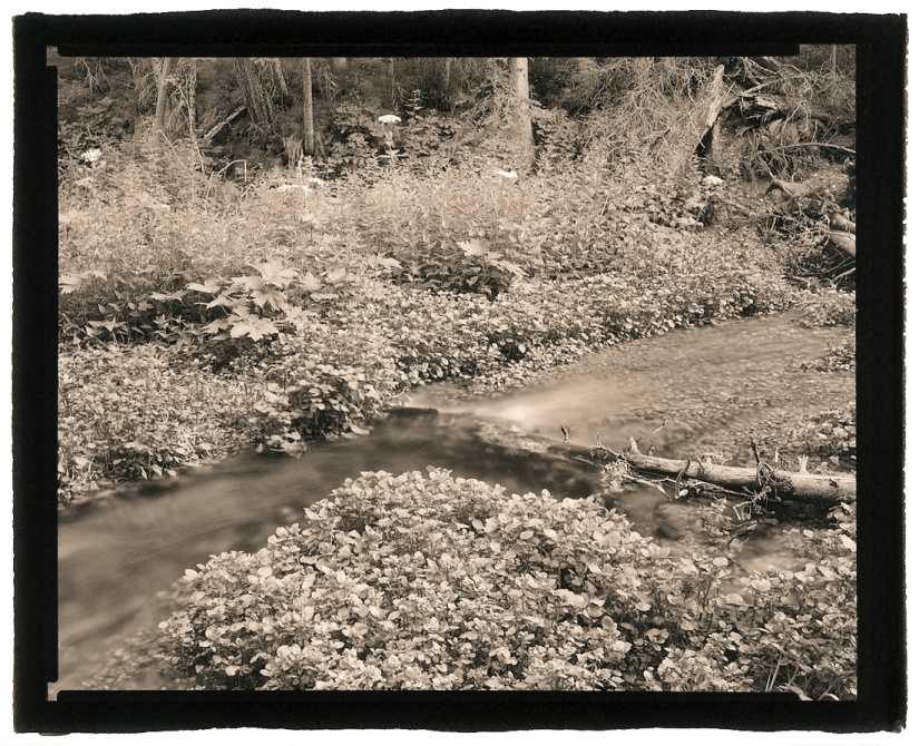
I ended up with 2 9×11 pieces left after finishing all of the step wedge tests, enough for 2 8×10 prints of an actual negative. Above: A palladium print using 0.75ml FO + 0.75ml Pd + 1 drop 5% Na2 + 2 drops Tween 20, developed in potassium oxalate at room temperature. Below: A palladium print using 0.75ml FO + 0.75ml Pd + 1 drop 2.5% Na2 + 2 drops Tween 20, developed in potassium oxalate at 120°F. The negative has a density range of 1.6. This print has a wee bit more contrast than when printed on Platine with 5% Na2, though it could stand a little more exposure.
Conclusions
I’m reluctant to draw any definite conclusions based on the limited tests I’ve been able to do so far. I can say that based upon the 4 sample sheets I was sent to test, Hahnemuhle Platinum Rag is a welcome addition to the range of papers suitable for platinum/palladium printing. In summary, it seems to be quite easy to work with:
- has a very smooth hard surface
- coats easily and with slightly less solution than what I consider normal
- has a shorter tonal scale and prints with about 1 “grade” more contrast than Platine
- printing with palladium developed in potassium oxalate yields a pleasing warmth even without heating the developer
- clears easily
One thing I am concerned about is that while pricing has not been announced yet, I have heard that it is expected to be 25-30% higher than Platine and COT320 which are already fairly pricey. For a machine-made paper without deckled edges I’m not sure how well this is going to go over unless Hahnemuhle is able to conquer the consistency issues that have afflicted most of the papers we use for platinum/palladium and other hand-made alternative photographic printing processes.

Hello Keith,
A quick question about your UV bulbs.
“With my Hitachi BL bulbs the standard exposure time is 2:15. (Yes, 2 minutes and 15 seconds – wicked fast!)”
Those are fast, I’m thinking of upgrading. Do you have the full description, size, watts, etc?
Thanks, much appreciated.
regards,
Ralph
Hi Ralph – Here’s a link to the bulbs I use:
https://www.topbulb.com/f20t9-bl-20w-fluorescent-blacklight-bi-pin-base
Cheers,
Keith